The Psychology of Color in Event Design: How Color Choices Impact Guest Emotions

Color isn’t just about making things look pretty. I mean, yes, it does make things look pretty—but it’s so much more than that. Color is like a secret language, speaking directly to our emotions without us even realizing it. It whispers to us, nudges us, sometimes it even shouts. And when it comes to events, those whispers and nudges are everything.
Choosing the right colors for an event isn’t just about what you like or what looks good in photos—it’s about how those colors make people feel. That’s the heart of it. Colors set the tone, shape the atmosphere, and guide your guests' emotions in ways that are often subtle but deeply powerful.
Why Color Matters in Event Design
Here’s the thing: the colors you choose will directly impact how your guests feel. Whether they realize it or not, their mood, energy, and engagement can shift based on the color scheme alone. That’s why color psychology is such a powerful tool in event design—it allows you to craft an emotional journey for your guests.
Let’s break it down. Different colors evoke different emotions, and knowing how to use those emotions to your advantage can make all the difference. Do you want your guests to feel energized and excited? Or calm and introspective? The colors you pick will help shape that experience.
The Emotional Language of Color
Let’s look at a few common colors and how they tend to affect mood:
Red: Red is the color of passion and energy. It grabs attention, increases heart rates, and evokes excitement. It’s bold and can even feel a little aggressive if overused. If you want to spark conversation or create a sense of urgency, red is your color. But tread lightly—it’s powerful and can overwhelm if you don’t balance it with softer tones.
Blue
The color of calm. Blue brings a sense of serenity and peace, which is why it’s often used in spaces where you want people to feel relaxed or contemplative. Light blues can create an airy, open feel, while deeper blues add a sense of elegance and sophistication. If you’re hosting a corporate event or something more formal, blue can be a great choice to help people focus and stay calm.
Yellow
Yellow is all about warmth, positivity, and energy. It’s bright, cheerful, and feels optimistic. Perfect for daytime events, or any setting where you want to inspire creativity and conversation. But like red, too much yellow can feel overstimulating, so balance is key.
Green
Green is the color of balance, growth, and nature. It has a calming effect, similar to blue, but with a sense of renewal and vitality. It’s perfect for outdoor or garden events or anytime you want to bring a fresh, peaceful vibe into a space. Green is known to reduce stress, making it an ideal choice for events that need to feel relaxed yet refreshing.
Purple
Purple brings a sense of luxury, creativity, and a bit of mystery. It has historically been associated with royalty and wealth, so it works well for events that need a touch of elegance. Lighter shades of purple, like lavender, feel soft and soothing, while deep purples can make a space feel dramatic and high-end.
Brown
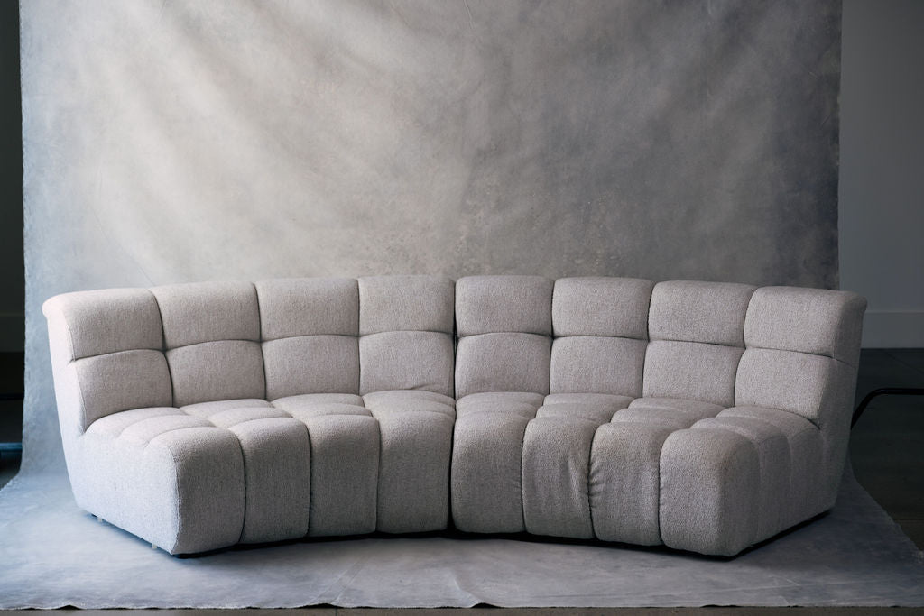
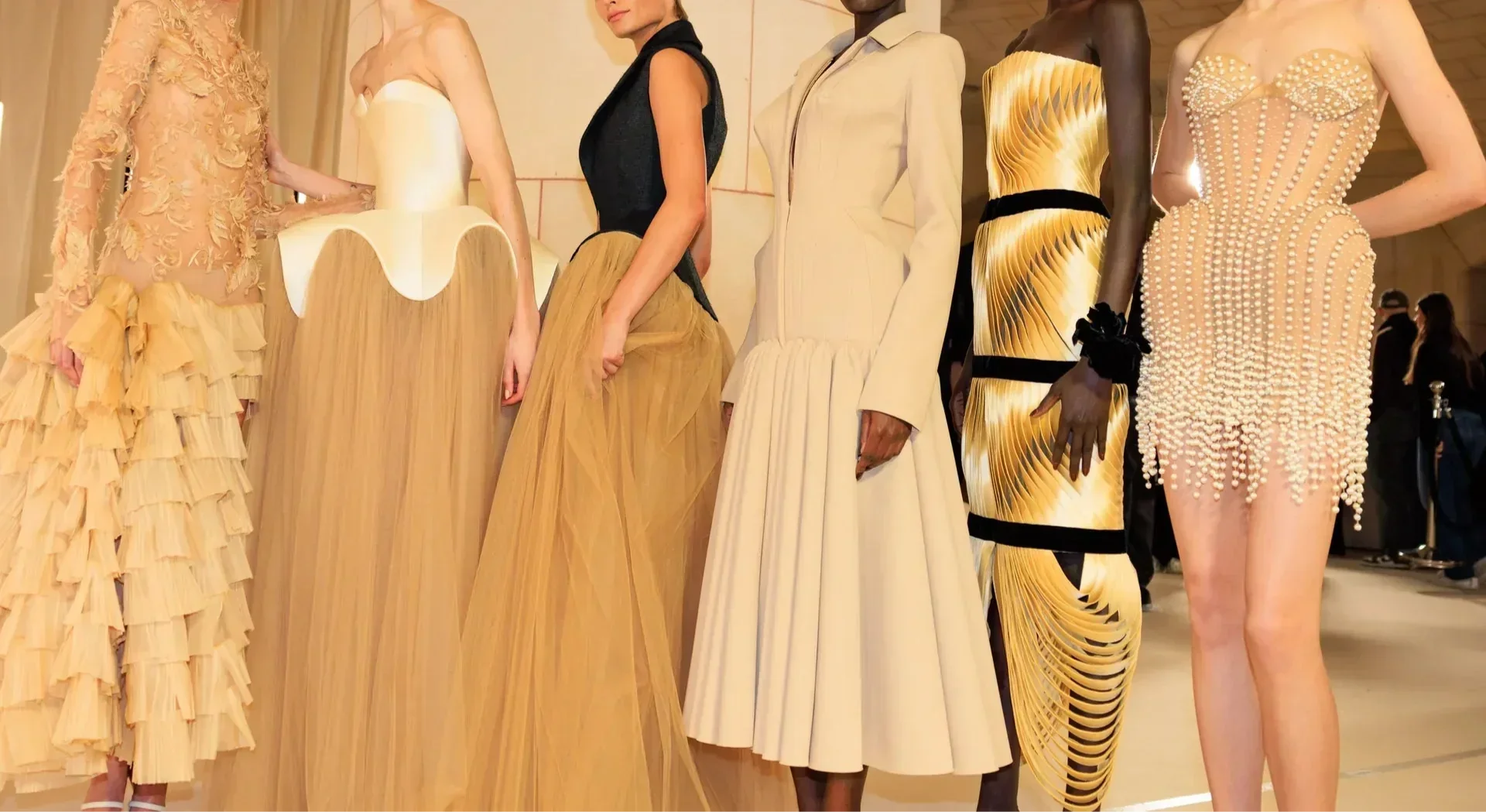
Brown is often associated with warmth, stability, and a grounded, earthy vibe. It brings a sense of comfort and reliability, making guests feel secure and at ease. Brown works beautifully for outdoor or rustic events, adding a natural, down-to-earth atmosphere. It’s versatile—richer, darker browns can evoke a sense of elegance and warmth, while lighter shades like taupe or beige can create a soft, neutral backdrop that allows other colors to shine. Brown might not be flashy, but it’s a solid choice for events where you want people to feel relaxed and connected to the space.
White
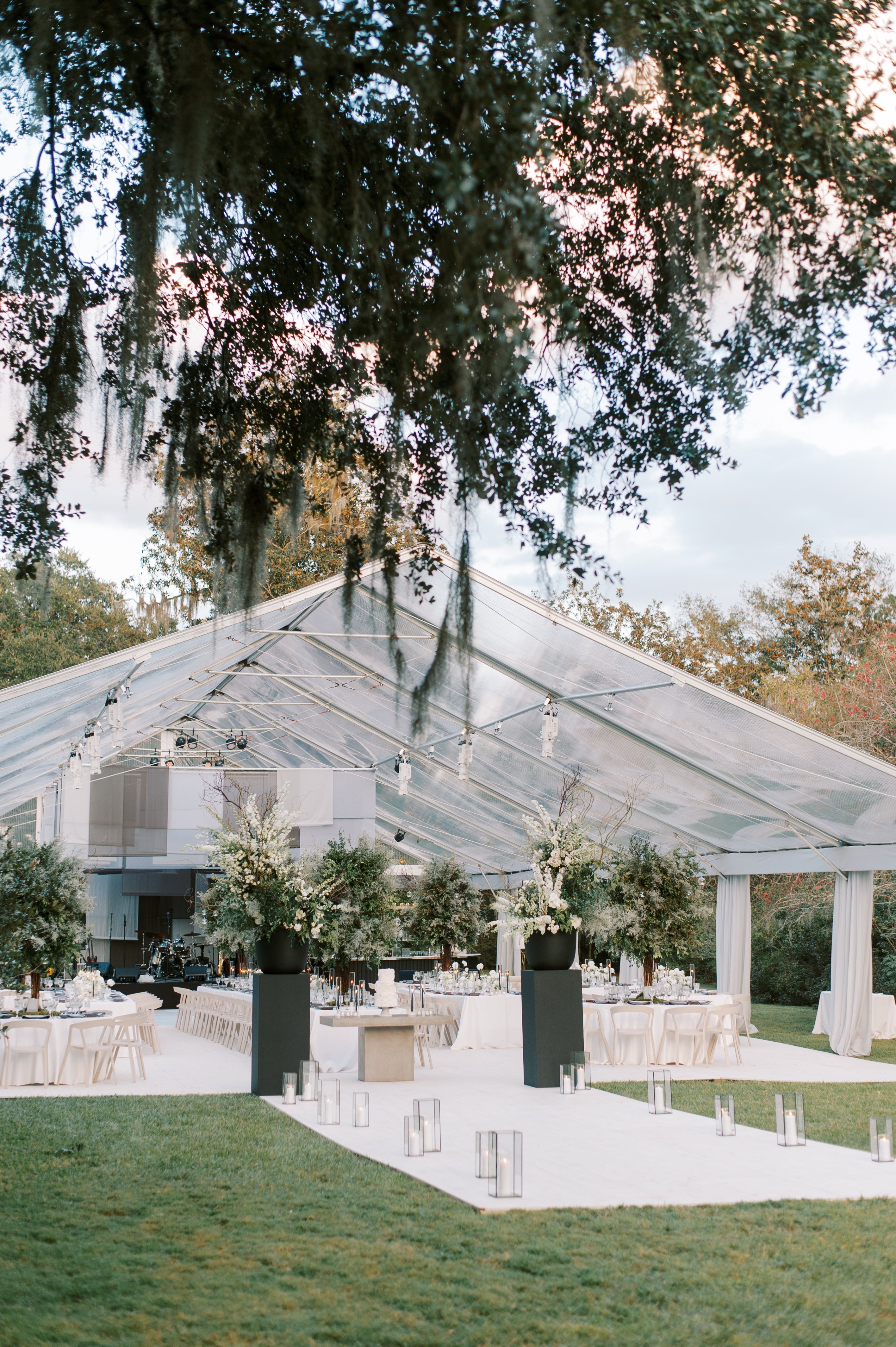
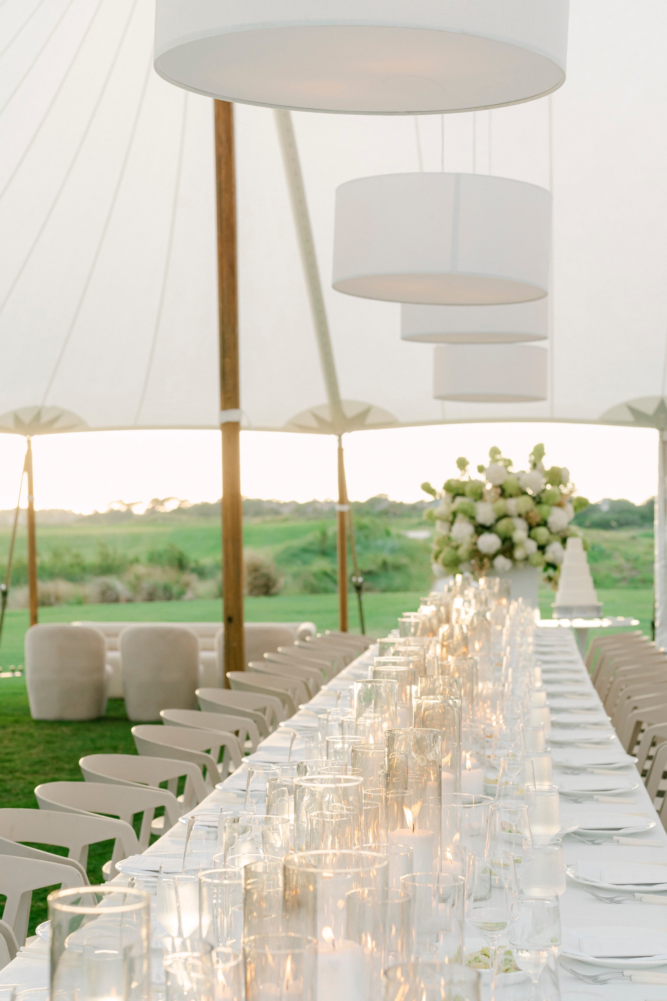
White is your go-to for simplicity, cleanliness, and elegance. It opens up a room, making it feel larger and more spacious, and it also pairs well with just about any other color. It gives guests a sense of clarity and focus, making it perfect for events where you want the space to feel sophisticated and free of distractions.
Black
Black is bold, classic, and grounding. It can bring a sense of sophistication and authority, but too much of it can feel heavy. Black works beautifully as an accent color or for evening events where you want to create a sense of formality.
Choosing the Right Colors for Your Event
So, how do you choose the right colors for your event? Here’s where it gets fun—and a little strategic. The trick is to think about the kind of experience you want to create and how you want your guests to feel.
1. Match the Colors to the Event’s Purpose
First, consider the type of event. A corporate seminar is going to call for a very different color palette than, say, a wedding or a gala. For corporate events, stick to colors that promote focus and calm. For celebratory events, like weddings or parties, you might lean into more joyful, energetic colors.
2. Think About the Time of Day and Season
The time of day and season can also play a big role in choosing the right palette. Daytime events tend to work well with lighter, brighter colors that reflect natural light—think whites, soft pastels, and yellows. Evening events, on the other hand, can handle deeper, richer colors like burgundy, navy, or emerald green, which create a more intimate and dramatic feel. And if it’s an outdoor, seasonal event, let the environment guide your palette—greens and earth tones for spring, warm oranges and browns for fall.
3. Consider Guest Experience and Flow
As you plan the colors, think about how your guests will experience the space. Are there areas where you want to energize them? Maybe that’s where you bring in brighter colors. Are there spaces where you want them to feel calm and focused? Softer, cooler tones work well for those moments. The key is to create a flow, where different parts of the event have distinct energy, but still feel connected.
4. Balance Bold Choices with Neutrals
If you’re drawn to bold colors, lean into it. But balance them with neutrals or softer shades to keep things from feeling too intense. For example, if you’re working with a lot of red, pair it with white, gray, or soft pinks to tone it down a bit. The balance keeps things from overwhelming the senses while still making an impact.
Why Color Psychology is So Powerful
At the end of the day, color is a tool—a way to communicate with your guests on an emotional level without saying a word. It’s one of the easiest ways to set the tone, create a vibe, and guide people through an experience that feels intentional and memorable. When you take the time to choose your colors thoughtfully, you’re not just decorating a space—you’re creating an emotional journey for everyone who steps into it.
